In short
- A good palette usually has three colours plus green: main, supporting, accent.
- Choose colours with season, light and venue in mind, not just taste.
- Coordinating does not mean copying: flowers identical to the outfits disappear in photos.
- Ask your florist which flowers in your month really come in that colour.
Colour is the first thing guests notice when they walk into the church or the reception room. It is also one of the decisions couples put off most often, because it seems simple. This guide helps you build a wedding colour palette for your flowers from concrete elements: season, venue, light and outfits. At the end you will find a scheme to use with your florist, wherever you are planning from.
Where to start: the venue
Before you open a folder of inspiration, look at photos of the venue. Walls, floors, curtains, the colours of the garden or the sea are already a palette. The flowers complete it.
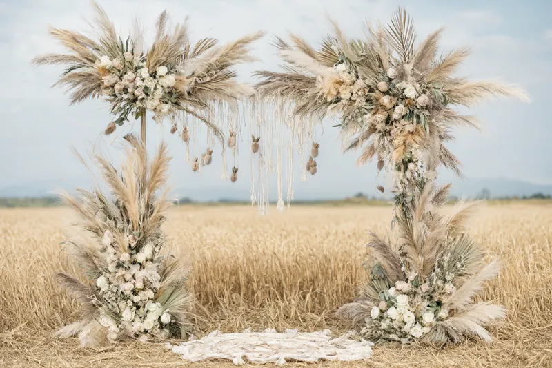
- Pale stone and white plaster (Puglia farmhouses, cloisters, villas in the South): these take both white and green and warm colours such as peach, terracotta and yellow.
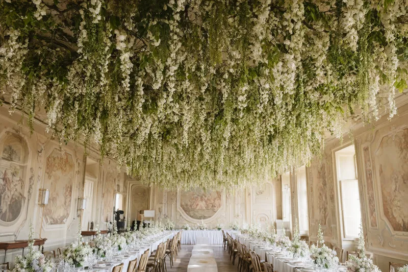
- Frescoes, dark wood, velvet (historic palazzi, grand reception rooms): deep tones such as burgundy, plum and dusty pink look good here.
- Modern architecture and glass: reduced palettes, monochrome, sharp contrasts.
- Gardens and parks: there is already plenty of green, so pastels or white add light.
If you are still choosing where to marry, the wedding florists in Italy listed on our site work in very different venues. Looking at their projects helps you see how the same colour changes from one place to another.
The season decides many colours
Each season has flowers that are easy to find in certain colours. Using them makes the palette more realistic and often kinder to the budget. The table below is indicative: it depends on the year and on where the flowers come from.
| Season | Colours that come naturally | Helpful flowers |
|---|---|---|
| Spring | Pastels, white, soft yellow, lilac | Ranunculus, tulips, anemones, peonies towards May |
| Summer | White and green, peach, coral, blue | Hydrangeas, garden roses, lavender, agapanthus |
| Autumn | Rust, burgundy, mustard, dusty pink | Dahlias, roses, berries, coloured leaves |
| Winter | White, deep red, dark green, silver | Amaryllis, hellebores, anemones, branches and conifers |
To see what each month offers, read our guide to seasonal flowers in Italy.
Light changes colours
The same flower looks different at midday, at sunset and under lamps.
- Full daylight, outdoors: very pale pastels tend to wash out. Slightly more saturated tones, or white with plenty of green, work better.
- Sunset and outdoor dinner: warm colours (peach, apricot, terracotta) glow.
- Room with warm artificial light: blue and purple tend to look much darker. White turns yellowish.
- Candles: they flatter pink, cream and warm tones. See also our guide to flowers and candles.
Ask your florist to show you the flowers in the light they will be used in, at least in photos.
Outfits, linen and the rest of the scene
Flowers are not alone. Think about:
- the couple's outfits: ivory and bright white do not always sit well together;
- bridesmaids and best men: choose flowers close to the colour of their outfits, not identical;
- tablecloths and plates: a coloured tablecloth leaves less room for other colours in the flowers;
- stationery: invitations, the seating plan and menus can pick up the palette;
- the cake: if it has flowers, they must be coordinated and agreed with whoever makes it.
Three simple schemes to build your palette
| Scheme | How it works | Example |
|---|---|---|
| Monochrome | One colour in several shades | From cream to white to sage green |
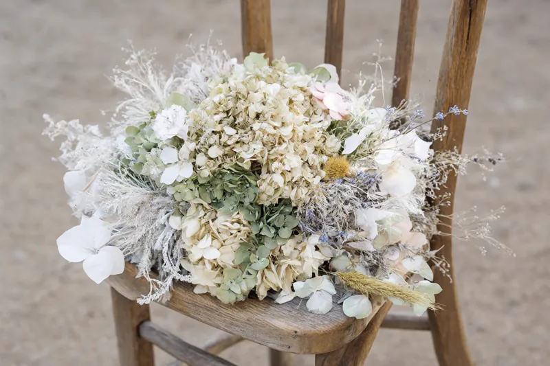
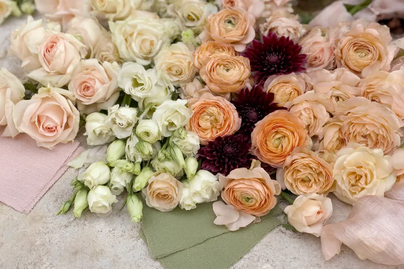
| Analogous | Colours next to each other on the colour wheel | Peach, apricot, coral |
| Complementary | Two opposite colours, one dominates | Powder blue with soft orange accents |
Monochrome is the easiest and looks elegant straight away. Analogous is soft and natural. Complementary has more energy but needs a light touch: usually one colour covers most of the design and the other stays an accent.
In every case there is a fourth colour you do not count: green. Eucalyptus, olive, ferns and ivy all have different greens, from grey to bright. That is a palette choice too. Read more in our guide to greenery and foliage in wedding flowers.
Colours and meanings in Italy
If you are coming from abroad, some Italian associations may surprise you:
- chrysanthemums are linked to mourning and to 2 November, the day Italians remember their dead;
- white is the traditional wedding colour, but colourful palettes are now very common;
- orange blossom is the historic symbol of marriage, so much so that the Italian phrase "fiori d'arancio" (orange blossoms) simply means getting married.
Beyond that, choose freely. For the meanings of individual flowers, read our guide to flower meanings.
The palette from ceremony to party
A palette does not have to be identical at every moment. Many florists let it evolve:
- a ceremony that is lighter and brighter, with white, cream and green;
- an aperitivo (pre-dinner drinks) where the supporting colours start to appear;
- a dinner with the strongest accents, brought out by candles and warm lights;
- a cake and dessert table that echoes the palette, with no flowers touching food unless agreed.
That way the wedding has a common thread, but each moment has its own atmosphere.
Colours and regions: northern light and southern light
If you are marrying in Italy and travelling from far away, remember that the light changes a lot along the peninsula. On the northern lakes and in the mountains the light is often softer and cooler: pastels, white and sage green look good. In the South and on the islands, with strong sun and light reflected off pale stone, pastels can look faded, and couples often choose bolder tones or white with lots of green. These are general tendencies: the time of day matters a great deal too. For weddings from abroad, see our page of destination wedding florists in Italy.
Common colour mistakes
- Choosing on a screen. Phone and computer colours are not reliable. Ask for photos of real flowers or samples.
- Asking for a colour the flower does not have. Not every variety exists in every colour. Artificial dyes show.
- Too many accents. An accent is lovely as long as it stays an accent.
- Ignoring the time of day. A palette designed for the evening can look dull at 11 in the morning.
Questions to ask your florist
- Which flowers in my month come in this colour, and how reliable are they?
- Will the colour look the same in church and at the reception, under different lighting?
- How would you use greenery in this palette?
- Can I see a sample, or at least a photo of the chosen flowers?
- How would you coordinate the bouquet, the bridesmaids' outfits and the centrepieces?
To sum up
A well-chosen palette holds the wedding together even when the style of the arrangements changes from ceremony to dinner. Start from the venue, check the season, think about the light and leave room for greenery. To define the overall atmosphere, read our guide to wedding flower styles.
Once you have your three colours, request a quote from several florists and compare how each would turn them into real flowers.