In short
- A good mood board has 10 to 20 consistent photos, not a hundred scattered images.
- Add a note to each photo: what you like, the colour, the shape, the atmosphere.
- Include what you do not want: it clarifies the style better than any description.
- Remember that many online photos show out-of-season flowers, perfect light and large budgets.
A wedding flower mood board is the bridge between what is in your head and what your florist will create. Done well, it saves meetings and misunderstandings. Done badly, with too many different images, it confuses. This guide explains how to build one, what to include and how to use it at your first meeting. For couples planning an Italian wedding from abroad, it is often the main way to explain your taste.
What it is really for
A mood board is not a shopping list. It communicates three things:
- the atmosphere: elegant, relaxed, structured, abundant, minimal;
- the colours: the main palette and the supporting tones;
- the shapes: low or tall arrangements, compact or airy, symmetrical or loose.
With those three pieces of information, a good florist can suggest flowers that suit the season and the venue. You can then compare florists who work in that style, starting from our list of wedding florists in Italy.
Where to start
Before you look for images, answer a few questions:
- Where are you marrying? A villa, a masseria (a southern farmhouse), a baroque church, a beach, a mountain lodge, a city rooftop.
- In which season?
- What do you want guests to feel as they walk in?
- Which colours do you like on yourselves and around you?
Venue and season shape the choices more than abstract taste. A design full of peonies is easy in May and difficult in October. For an overview of styles, read our guide to wedding flower styles.
How to choose the photos
Look for photos of real weddings, not just studio arrangements. Then follow these rules:
- one photo per element: bouquet, ceremony, centrepieces, top table, details;
- the same style family: mix minimal and baroque and the message gets lost;
- photos with context: a whole table says more than one flower in close-up;
- a written note on what you like in each photo: "the colour", "the height", "the trailing greenery".
The palette
The palette is the list of colours in your design. It usually has:
- one or two main colours;
- two or three supporting colours, lighter or darker;
- greenery, which is always a colour in its own right: grey like olive and eucalyptus, bright like ruscus, dark like magnolia.
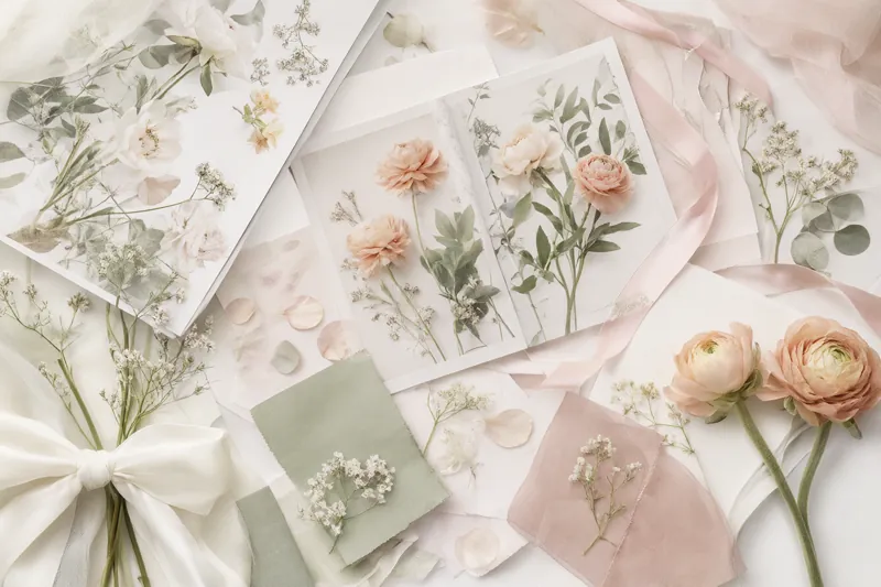
Putting a colour swatch next to the photos helps. If you have fabric from the dress, the table linen or the invitations, share it at the first meeting, or post a sample if you are abroad. To match colours with season and venue, read our guide to wedding flower colour palettes.
Limits, mistakes and what you do not want
What online images do not tell you
The photos you find on social media and pinboards are beautiful, but often misleading. Here is why:
| What you see | What is behind it | What to ask |
|---|---|---|
| Flowers from every season together | Imported flowers or studio arrangements | What is available on my date? |
| Perfect light and saturated colours | Retouching, golden hour, filters | How will it look in my venue's light? |
| Huge installations | Large budgets, days of set-up | What can be done on my budget? |
| Designs with no laid table | Photos taken before place settings | How much room is left for plates and glasses? |
| Flowers that never wilt | Photos taken right after set-up | What will survive heat for many hours? |
| The same flower everywhere | A variety that may be rare in Italy | What similar alternatives are there? |
Do not give up the photos you love. Use them as a starting point and ask the florist how to translate them to your reality.
Common mistakes
Some mistakes come up again and again in the mood boards florists receive:
- too many images, collected at different times and reflecting different tastes;
- only details, with no overall view of the room or the ceremony;
- no hint of budget, so the florist does not know whether to suggest one installation or three arrangements;
- several photos of the same arrangement from different angles, adding no information;
- references to specific flowers rather than colours and shapes, with the risk of falling for a flower that is not around in your season.
If you spot one of these, remove images rather than adding more. A shorter mood board is almost always clearer.
What you do not want
A short section, but a very useful one. Add two or three images of things you do not like, with a note: "too stiff", "too colourful", "no artificial flowers", "no strong scents at the table".
If any guests have allergies, say so. A florist used to international couples will also steer you away from flowers with particular meanings in Italy, such as chrysanthemums, which are linked to funerals. See also our guide to the meaning of flowers.
How to organise it
A simple format works better than an elaborate presentation. One page or one shared folder with:
- Atmosphere: two or three overall photos.
- Palette: colour swatches and one reference photo.
- Ceremony: one or two photos.
- Reception: centrepieces, top table, buffet or table plan display.
- Personal flowers: bouquet, buttonholes.
- What you do not want.
- Practical notes: venue, season, indicative budget in euros.
If you work with a wedding planner, share the same mood board with them and the florist, so everyone starts from the same base.
Three example mood boards
To show how it works, here are three imaginary examples. They are not templates to copy, just a way of thinking.
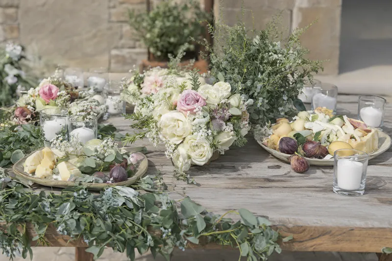
Hillside villa, early summer. Atmosphere: romantic and soft. Palette: warm white, blush pink, peach, sage green. Photos: a long table with low garlands, a loose bouquet with garden roses, a garden ceremony with arrangements along the aisle. Not wanted: strong colours, stiff arrangements.
Masseria in the South, late summer. Atmosphere: Mediterranean and relaxed. Palette: white, olive green, terracotta, lemon yellow. Photos: olive branches on the table, potted citrus, a bouquet with grey-green foliage and heat-tolerant flowers. Not wanted: delicate flowers that wilt in the sun, lots of candles outdoors in the wind.
Lakeside, spring. Atmosphere: elegant and bright. Palette: white, pale green, a touch of lilac. Photos: tall, airy centrepieces, a floral arch with a view of the water, a compact bouquet. Not wanted: dried flowers, dark tones.
In each example the palette and the photos speak of the same atmosphere, and the "not wanted" section sets the limits straight away.
How to present it to your florist
At the first meeting, do not ask "can you do this?". Ask:
- "What strikes you in these images?"
- "What would you change for my season and my venue?"
- "What is realistic on my budget?"
A good florist will reply with proposals, not a copy. They will tell you where your idea works and where an alternative is needed. To prepare the conversation, use our list of questions to ask your wedding florist.
If you are marrying from abroad
For a destination wedding the mood board matters even more, because meetings happen remotely. Share it in an online folder, write your notes in English or whichever language you will use together, and ask the florist to reply with a visual proposal of their own. You will find florists used to international couples in our list of florists for destination weddings.
Questions to ask your florist about the mood board
- Which of these images are realistic in my season?
- Which flowers would you use to get this effect?
- How does the palette change in the venue's light?
- What would you take out to stay within budget?
- Will you send me a visual proposal before the final quote?
The next step
With your mood board ready, the site visit and design move faster. Read our guide to the site visit with your florist and then request a quote, attaching your reference images.